Zones preferences in population mobility
People tend to perform most displacements around a limited number of locations; they roam close by their main locations (e.g., home or work); and their travel distances are restricted to the area containing their principal life-related locations. Aware of this, we study the daily mobility flows of a population to identify the daily routine of people according to their habits of movements and visits.
Time-varying weighted graph construction
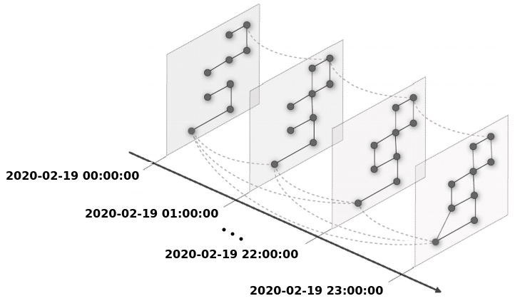
In order to analyze and to capture the interaction between people and the urban scenario during the time-dependent weighted graph G(V,E). First, according to the dataset temporal aggregation into bins of constant time intervals, one graph is built per time interval, describing the flows of users, i.e., the edges E, between neighboring SFR-IRIS zones, which represent the vertices V. Next, the time-dependent weighted graph is composed of the set of temporal discretized graphs, where each vertex is connected to itself in the future. Figure below shows an example of a time-dependent graph composed of graphs generated for intervals of one hour.
Capturing behaviors with centrality
Based on the graph described above, we analyze population behavior using centrality metrics.
- Desire lines: Betweenness centrality. The concept of desire lines states that people tend to choose the shortest paths to arrive at their destinations.
- Locality of people movement: Closeness centrality. Human mobility is generally confined to a limited area. Even if people are not using the shortest routes, they are at least not moving far from their home location.
- Number of frontiers: Degree centrality. Not only mobility flows, but simple geography also plays a role in the importance of an urban area. For example, the higher is the number of frontiers a certain SFR-IRIS zone has with other zones, the higher is its disease-spreading potential, since it can be easily reached by different mobility flows.
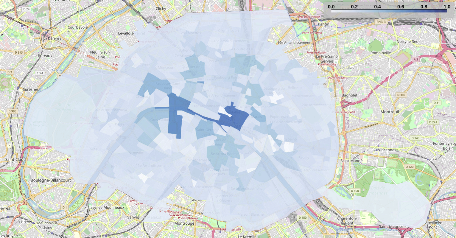
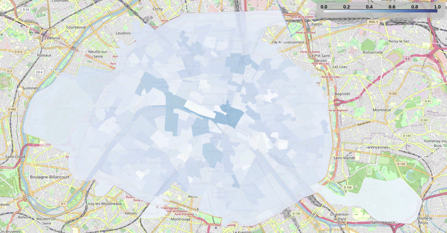
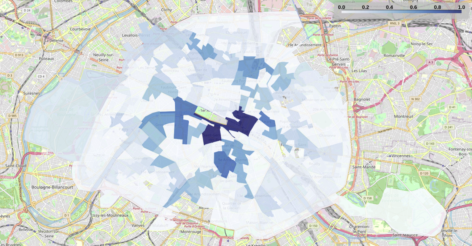
Betweenness centrality
In the Figures below, the betweenness centrality is represented for all the SFR-IRIS in Paris, before and during the lockdown. The centrality values in the figure are normalized with respect to the maximum value of each period, so they should not be directly compared.
While the SFR-IRIS with a high betweenness before the lockdown preserve their relative importance, we observe a much more uniform distribution of the metric, especially in more peripheral areas. Thus, in addition to the reduction in the flow of people due to the lockdown period, we also observe a change in the distribution of the most used paths, with some alternative routes that are much better represented during the lockdown.
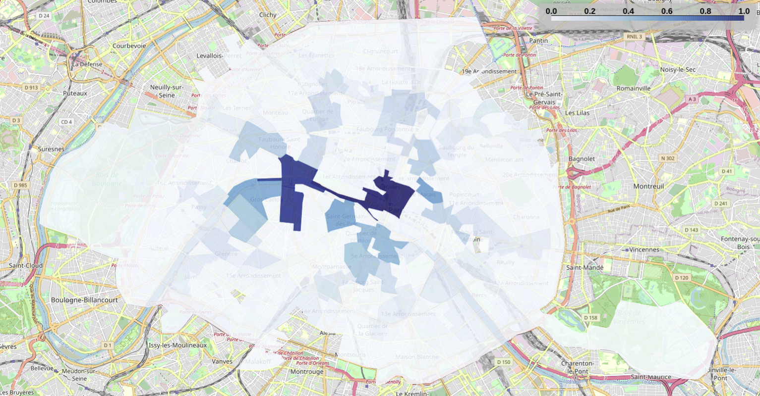
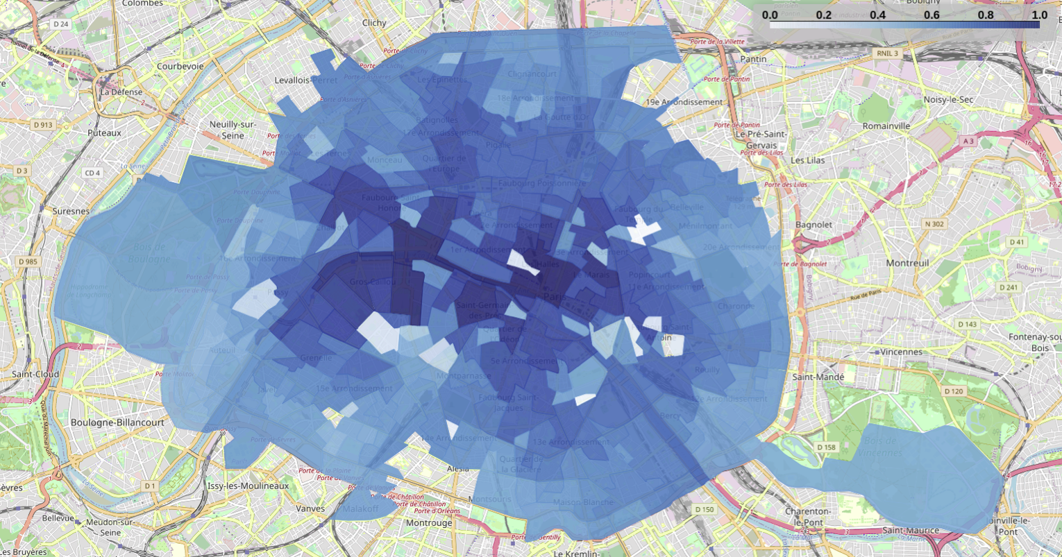
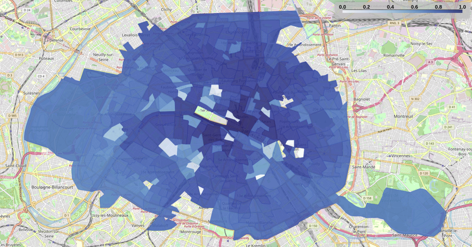
Closeness centrality
The darker regions of Figures below indicate the most central regions considering the flow of people, that is, the regions with high closeness centrality represent the most visited SFR-IRIS in our dataset in each period. Once again, we normalize the centrality results with respect to the maximum value observed in each period. This allows us to detect the areas most used by people who continue moving, even though we had a significant flow reduction in general during the lockdown period.
Similarly to betweenness results, we perceive the regions in the center of Paris to rank the highest in terms of closeness centrality before the lockdown period. During the lockdown period, we can also observe that the Eastern and Northern regions of Paris rank similarly to the central region. This is because the highest rates of flow reduction occurred mainly in central Paris. In this way, the flows of people existing during the lockdown are more uniformly distributed across Paris and not concentrated in the center.
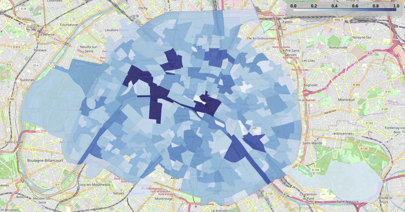
Degree centrality
The degree centrality shows how connected is an SFR-IRIS in the weighted graph, i.e., how many neighbor zones of a SFR-IRIS disseminate (respectively attract) population flows to (respectively from) the given area. Regardless of the intensity of transiting flows, two SFR-IRIS are considered as neighbors only if there is at least one transiting flow between them.
Note that Figure below only shows the degree results for the period before the lockdown, as the city does not change shape during the lockdown. This lack of difference is due to the fact that the lockdown does not affect how the SFR-IRIS are connected in the graph (since the condition of “at least one transiting flow” does not change the graph connectivity), although the intensity of flows among SFR-IRIS reduces significantly during the lockdown.
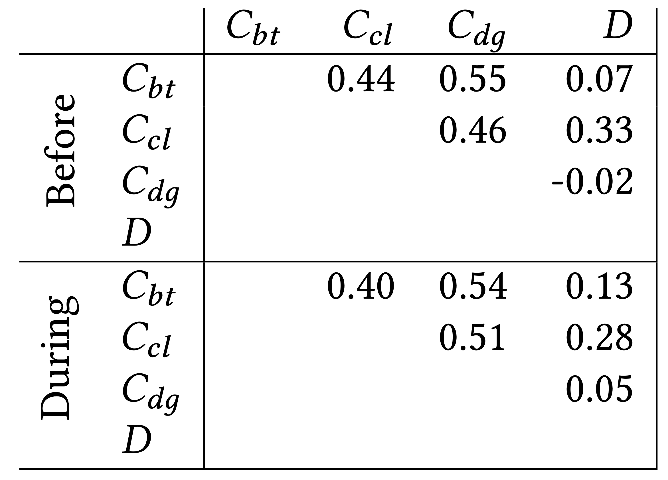
Impact-factor of zones
For the calculation of the impact-factor, we use a linear combination using the three centralities: betweenness (𝐶𝑏𝑡), closeness (𝐶𝑐𝑙), degree (𝐶𝑑𝑔), as well as the density (𝐷). We analyze the Pearson correlation among all metrics considered in the impact-factor computation. A certain correlation exists between the metrics, but it is not significant, as shown in Table below, confirming that each metric captures a complementary movement/activity behavior of the city population. Such a weak correlation justifies considering the four metrics in the following linear combination model:
𝑅𝐹(𝑖) = 𝛼𝐶𝑏𝑡(𝑖)+𝛽𝐶𝑐𝑙(𝑖)+𝛾𝐶𝑑𝑔(𝑖)+𝛿𝐷(𝑖), where 𝑖 is the given SFR-IRIS and 𝑅𝐹 (𝑖) is the impact-factor of 𝑖. 𝐶𝑏𝑡(𝑖), 𝐶𝑐𝑙(𝑖), 𝐶𝑑𝑔(𝑖) are the normalized values of centrality for SFR-IRIS 𝑖, and 𝐷(𝑖) is the normalized value of density of 𝑖. The coefficients 𝛼, 𝛽, 𝛾, and 𝛿 represent the proportion of each metric to be considered in the model, i.e., 𝛼 + 𝛽 + 𝛾 + 𝛿 = 1. The values of these coefficients are 𝛼 ≈ 0.33, 𝛽 ≈ 0.11, 𝛾 ≈ 0.21, 𝛿 ≈ 0.35.
The impact-factor of SFR-IRIS 𝑖 is then computed using the following linear combination:
𝑅𝐹(𝑖𝑟) =0.33·𝐶𝑏𝑡(𝑖)+0.11·𝐶𝑐𝑙(𝑖)+0.21·𝐶𝑑𝑔(𝑖)+0.35·𝐷(𝑖).
Figures below show the result of the impact-factor, before and during the lockdown. For the calculation of the impact-factor, we consider the value of centralities and density normalized by the maximum value obtained when considering both periods, which allow us (1) to capture the flow reduction during the lockdown and (2) to compare the impact-factor results between the two periods.
In particular, some SFR-IRIS in central Paris have the highest impact-factor values during both periods. The maximum computed impact-factor value is approximately 0.70 before the lockdown and of 0.40 during the lockdown. This lower impact-factor value during the lockdown is due to the reduction of the number of flows, as well as to changes in the centrality and density ranking.
Finally, the Figures show that during the lockdown: (1) IRIS zones that were top-ranked before the lockdown have their impact-factor reduced, which is explained by the reduction in attendance and visitation of zones, and (2) some new top-rank impact-factor IRISs appear (discussed below), reflecting the density increase in certain zones (e.g., parks).